Since 1985, the Windows operating system has survived seven reincarnations, at least when it comes to consumer versions. The product is developed, acquired new capabilities, pushing forward IT-industry, and with it has passed through many evolution including Windows logo. If you put them all side by side, you get a very entertaining picture:
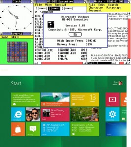
To some extent, the Windows logo reflects the stages of the development platform and its interfaces. A simple, flat, text-based Windows 1.0 is reflected in the icon. In Windows 3.1, was made a qualitative leap, the logo has changed a lot, too. Windows 95 is not far away from its predecessor technically, though outwardly changed fundamentally – a small change in the logo.
Compare the interfaces of Windows 1.0 and Windows 8. Remotely have something in common.
Windows XP – go to the kernel of Windows NT, previously applied only to the server versions of OS and a brand new icon. A strange version of Windows Vista has pleased the “glass” interface, which is reflected in the logo. But Windows 7, the quality, stability and performance equate to the legendary Windows XP – the logo of this product is very similar. In Windows 8, Microsoft has gone to total simplifying the interface and back, we can say to the roots. Logo consistent and resembles that of Windows 1.0. The story develops in a spiral.
At present Windows logo designer is Andrew Kim showed who showed this evolution on his official website.

